Nailing where a hurricane makes landfall is not easy. Meteorologists have to consider many factors when determining the track of a tropical storm or hurricane.
Assessing the impacts and risks associated with a tropical system presents an even bigger challenge for meteorologists.
The National Hurricane Center (NHC) provides a plethora of graphics and tools to the public.
Local on-air meteorologists interpret model information as well. Yet, being able to present it effectively for the public to take action can prove to be a difficult task.
Fortunately, meteorologists continue to explore how they can increase and guarantee viewership comprehension on all levels.
Caught up on categories
The category of a hurricane is merely just a ranking based on its strongest sustained winds measured. That’s all.
It doesn’t consider the storm’s positioning, in addition to all the other impacts it could bring. This includes excessive rainfall, flash flooding, the threat of tornadoes spinning up, or the leading cause of hurricane-related fatalities, storm surge.
A category 1 hurricane moving perpendicular onto and over land could bring greater impacts and damages than a major category 3 hurricane that says offshore, traveling parallel along the coast.
Despite the increasing efforts to address this fallacy, human nature seems to associate a storm’s category with its overall intensity and potential impacts on an area.
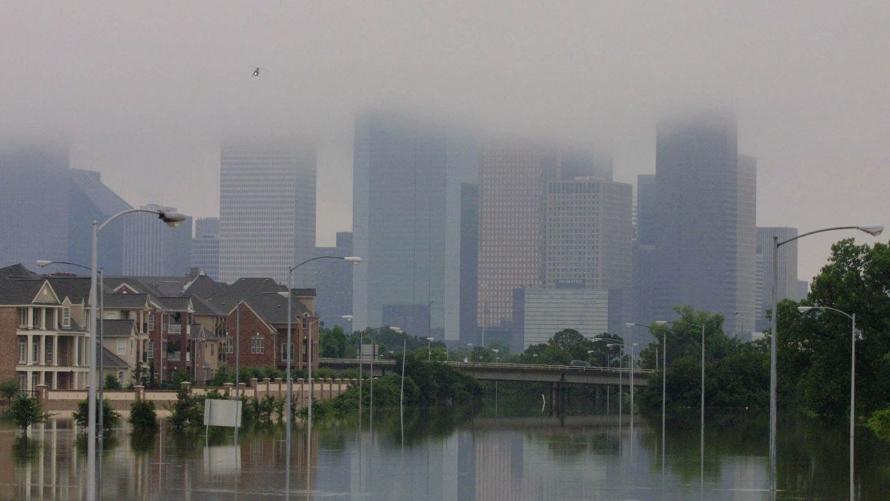
In 2001, Allison was only a tropical storm, but still brought significant flooding to Houston, Texas. (AP Photo/Michael Stravato)
Strengthening or weakening are trigger words, too. This isn’t necessarily a bad thing with a “strengthening” system, but could be misleading the other way around.
A tropical storm that gets promoted to a hurricane, or a hurricane that advances to a higher category, often reinforces awareness. The word “strengthening” harnesses a sense of urgency, alerting the viewer to pay closer attention to the forecast. At least sometimes, anyway.
On the contrary, a “weakening” system could imply the opposite, allowing the viewer to let down their guard. But this should not be the takeaway message; an area could still be at risk of facing serious impacts.
Conflicts with the cone
Among the most popular graphics and tools used by meteorologists, the infamous “cone of uncertainty” is also one of the most common visuals used to depict the predicted storm track.
Yet, it is also one of the most misinterpreted graphics by the general public.
In particular, the centerline that bisects the width of the cone remains controversial. While the intended purpose is to show the probable track of the storm, that’s not exactly what viewers take away. Instead, they see it as the exact track of the storm.
To eliminate this misconception, Spectrum News meteorologists based in Tampa and Orlando purposely omit the cone’s centerline in their forecast graphics.
Tampa’s Bay News 9 Chief Meteorologist Mike Clay explains, “We stopped using the center line after Hurricane Charley in 2004. We found that too many people were just concentrating on the line and not the whole cone.”
Chief Meteorologist Bryan Karrick from Spectrum News 13 in Orlando further explains, “If we eliminate it [the centerline], then we can focus on the cone of concern and areas where we may have storm impacts.”
Clay also stresses that, “the cone is not a forecast cone, it is an average error at those points. So the confidence, or lack of confidence, in the forecast is not reflected in the cone.”
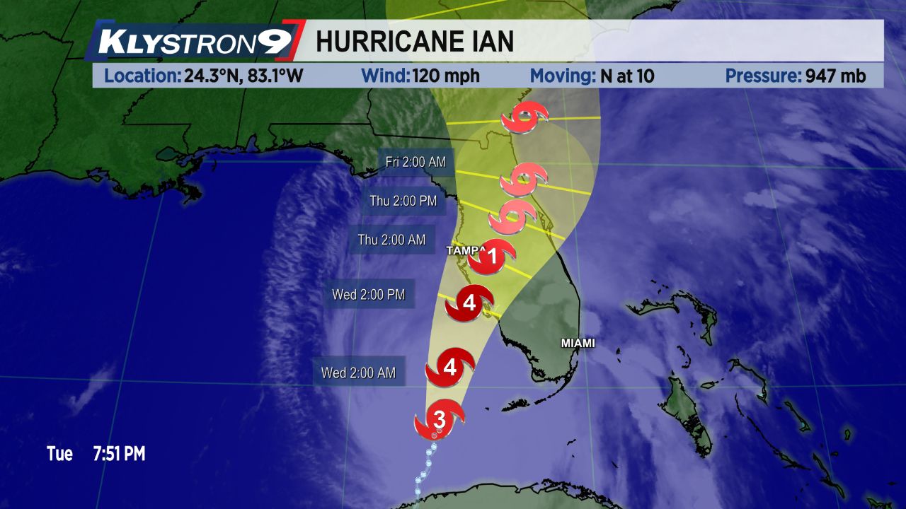
Bay News 9 graphic of Ian’s track without a centerline in 2022. (Spectrum News)
In 2016, a study performed by the University of California Merced closely examined viewers’ interpretations of hurricane risk with visualizations- specifically targeting the cone and the implications that it holds.
Subjects were asked to view five different graphics: NHC’s cone with and without the centerline, just the centerline, a blurred out version of the cone and an ensemble forecast.
After viewing the different renditions, subjects were asked what they thought each implied. The outcome uncovered that the cone merely failed to relay its intended message. Instead, subjects comprehended that the widening of the cone showed the storm was growing in size, which isn’t true.
In fact, the research revealed that the subjects comprehended the forecast track and potential impacts better through ensemble forecasts (or spaghetti plots). Although this approach is not always the sleekest-looking and could bring about more visual “clutter” for viewers to take in.
Regardless, the cone still proves to be a fan-favorite among media platforms and will continue to be in the foreseeable future.
With that in mind, Karrick reminds us that, “The impacts can and most often do extend well outside of the cone. It’s best to be prepared if you are anywhere near the path of a storm.”
Our team of meteorologists dives deep into the science of weather and breaks down timely weather data and information. To view more weather and climate stories, check out our weather blogs section.