You’ve seen the Spectrum News meteorologists talk about severe weather outlooks when stormy weather is in the forecast. They are issued by the Storm Prediction Center in Norman, Oklahoma, and give a general overview of the expected severe storm threat in a particular area.
But do you know what each of the five categories is, or the level of certainty that they convey? Did you also know the scale has changed over the years? We’ll tell you how to make sense of these severe weather outlooks and offer an alternative way to interpret these maps.
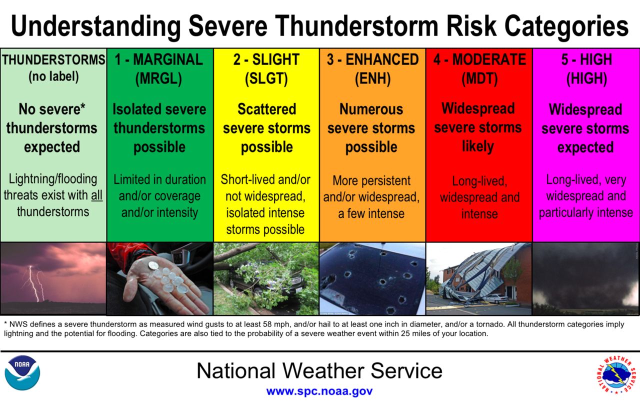
What do the five categories mean?
To many, they are colored blobs on a map, but they have a distinct meaning to the meteorologists at the Storm Prediction Center (SPC). Convective outlooks consist of a map and explanation, showing severe thunderstorm threat areas across the continental United States.
The outlook explanations are written in technical language and provide the meteorological reasoning for the risk areas. It’s our job to explain these outlooks in a way that’s easy to understand, but convey the importance of the threat.
The five threat levels start at marginal, which conveys the lowest risk of severe weather. It goes up to high, a signal that severe weather is likely within that area, and a major severe weather outbreak with multiple hazards and life-threatening storms is possible.
This is an example of a Day 1 convective outlook, which describes the expected conditions from the early morning of the current day until the early morning of the next day. Notice how all five levels are featured.
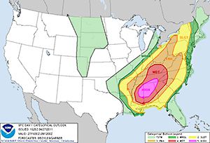
Example of a five-category severe weather outlook. (NOAA)
You may still be scratching your head why each category is called by that name. Why not just number the categories one through five? Why is slight not the lowest on the list?
To be honest, the Storm Prediction Center has a tough job of predicting dangerous weather across the entire U.S. and the categories should be taken as a guide and not set in stone. In fact, outlooks for a current-day severe weather event are updated up to five times. This is the best explanation we found for how to interpret the risk categories, straight from the SPC itself:
It is important not to rigidly associate the type of risk area (e.g., 2-SLGT-yellow) with the severe potential for any given thunderstorm in the risk area. That is, just because a 2-SLGT-yellow risk is forecast does not necessarily mean that the thunderstorms within the risk area will be slightly severe.
What the severe threat categories used to be
In the spring of 2014, the SPC updated the scale to include two new risk categories: marginal (level 1) and enhanced (level 3). Before that, a three-level scale was used (slight, moderate, high).
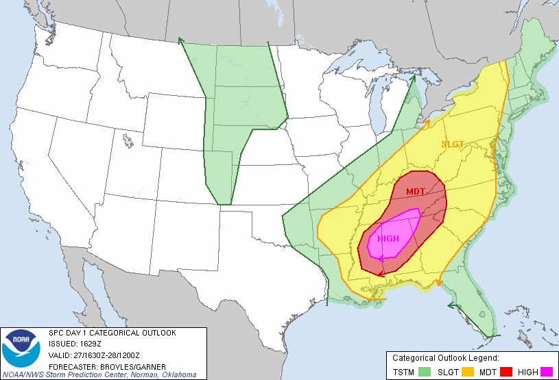
The same severe weather outlook as above, but with only the original three categories. (NOAA)
The SPC saw this as a beneficial change, an opportunity to better describe lower risks (below the slight category) and higher risks (above the slight category). Emergency managers liked the change, but some asked if this was beneficial to weather enthusiasts and the general public, or if it would just create more messy graphics or harder-to-understand explanations.
From a meteorologist’s point of view, the names of the new categories themselves–marginal and enhanced–are somewhat difficult to explain to the general public. But again, it’s still our job as broadcast meteorologists to interpret the data ourselves and explain the potential hazards and chances of severe weather to our viewers, no matter what the SPC outlook is called.
Rethinking the severe weather outlooks
No matter what, the everyone has access to and can interpret the severe weather outlooks themselves. That can lead to confusion and mixed messages being sent out, especially on social media (that’s a whole other conversation for a different blog). To add to the confusion, some local TV stations have their own severe weather risk areas, using the areas drawn by the SPC, but using their own color scheme and even category names.
Some in the weather community feel that the SPC convective outlooks could have a more simplified naming convention. This humble author has thought of a five-category naming convention that might be simpler for the public to understand, hopefully eliminating the need for broadcast meteorologists across the country to change it themselves. It could even keep the same colors the SPC currently uses. Let us know what you think.
LEVEL 1 – LOW: This would replace the “marginal” tag that exists now, communicating the lowest threat for severe weather.
LEVEL 2 – MINOR: The word “slight” used to mean the lowest risk. Now it means the second-lowest risk. I think we should get rid of that word altogether.
LEVEL 3 – MODERATE: When I think of “moderate,” I think of the middle, and I bet most people do, too. This would replace the “enhanced” tag that exists now.
LEVEL 4 – HIGH: When meteorologists see a “moderate” risk now (which is a level four risk), it means big trouble. I think “high” should be the tag used here, and save the highest risk with a more attention-grabbing phrase.
LEVEL 5 – EXTREME: Yes, this word gets thrown around a lot to describe things that aren’t quite that. However, the truest definition of the word conveys how serious this risk would be: “reaching a high or the highest degree; very great.”